asyncade.DESIGN STUDY / THREE DIRECTIONSBack to the original

THE SAME COMPANY. A DIFFERENT FIRST IMPRESSION.

One Asyncade.
Three perspectives.

Three complete visual directions for a company that builds worlds and solves real business problems. Explore each one, then tell us what feels like Asyncade.

Design first.
Business details come later.

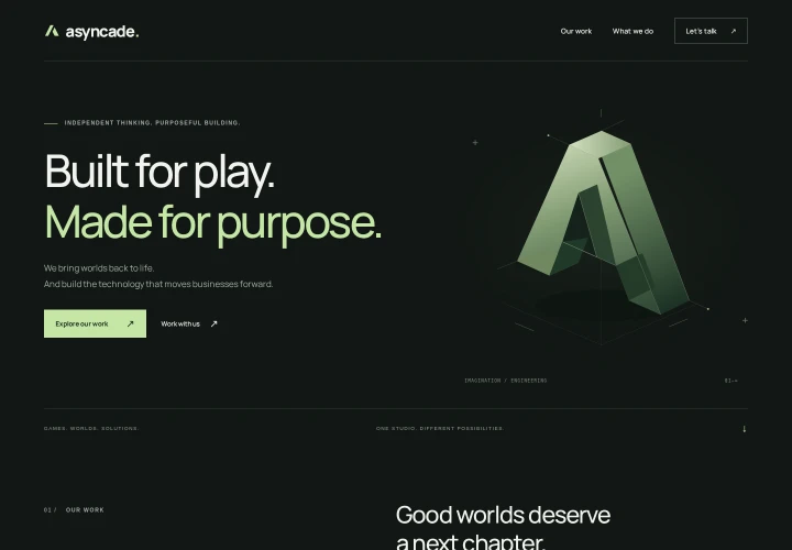
01 / ORIGINAL
Actual desktop preview of the dark sage Atmosphere concept

CALM / ARCHITECTURAL / BALANCED

Atmosphere

Quiet confidence. Charcoal, sage, precise typography, and a sculptural identity.

What works
The most balanced expression of games and bespoke IT. It feels considered, mature, and distinctive without trying too hard.
The trade-off
The dark palette is more studio-like than traditional consultancy. Nord uses abstract artwork rather than showing the game itself.
Best for
A single, coherent company identity that connects creative and technical work.
Explore concept 01
02 / ALTERNATIVE
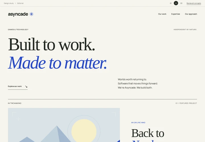
Actual desktop preview of the light Editorial concept

OPEN / EDITORIAL / REFINED

Editorial

A lighter perspective. Warm ivory, expressive serif typography, and a crisp cobalt accent.

What works
A more open, approachable first impression. The editorial hierarchy puts ideas and clarity ahead of visual effects.
The trade-off
Less immediate gaming energy. The serif-led identity feels more like a design practice than a game studio.
Best for
Leading with business credibility while keeping a thoughtful, creative personality.
Explore concept 02
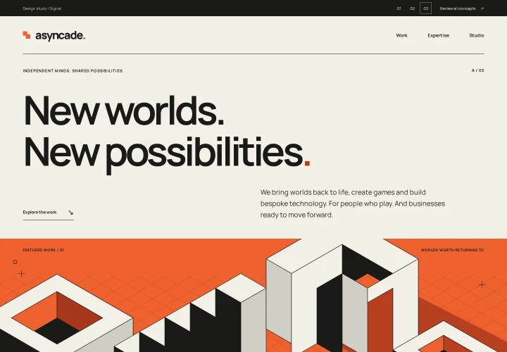
03 / ALTERNATIVE
Actual desktop preview of the graphic Signal concept

BOLD / SYSTEMATIC / EXPRESSIVE

Signal

A stronger signal. Oversized type, a rigorous grid, and a vivid orange interruption.

What works
The most assertive identity. Strong graphic rhythm makes the studio feel confident, creative, and technically focused.
The trade-off
Less quiet and elegant than the original. Its visual intensity can outweigh the more personal side of bespoke IT work.
Best for
A games-led studio that wants a memorable, unconventional presence.
Explore concept 03

DESIGN REVIEW / MY TAKE

My recommendation

Keep 01 — Atmosphere as the leading direction. It best balances the brief: straight to the point, sleek, serious, and elegant. It also connects the game studio and IT work without making either feel secondary.

Choose 02 if you want the business-facing side to lead. Choose 03 if you want Asyncade to feel more boldly like a creative studio.